Data visualisation enables you to increase the value users get from your mobile app. This blog will look at why Data visualisations matter and some suggestions for enhancing your designs. The ability to put data into your users' hands is a good thing. This is a special feature from several other apps.
For example:
- Project management tools allowing app users to track & manage their tasks
- CRMs help app users check on prospects and clients, cash flow, and sales pipeline
- Gaming apps show statistics, progress bars, and more
- Sales & marketing tools that render performance analytics
- Booking apps that convert location data into interactive maps
However, the Data visualisation is not only that matters, but how it's designed within your mobile app's space matters too. Therefore, today, we would talk about what enhanced Data visualisation design can do for app users' experience.
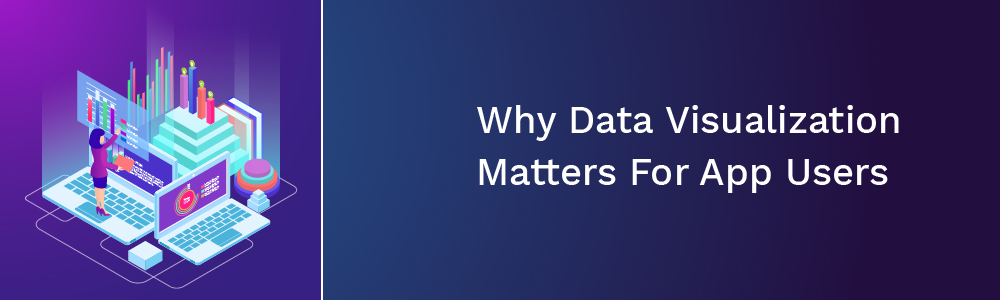
Why Data Visualisation Matters For App Users
Although big data has undoubtedly enhanced the way we run our businesses and our lives, several people don't enjoy poring over that data to get meaning out of it. Data visualisation is a valuable solution here. For example, the UPS mobile app's location finder tool:
UPS is a gigantic company with over 5000 stores all over the US & Canada. In metro areas like Providence, app users might practically end up with dozens of closeby locations to pick from. This is too much information to gulp at once. However, Data visualisation lets users to pick out the stores close to their locations quickly:
The best thing about this Data visualisation is that the similar location data does not display until the user clicks on one of the pins. This makes all of this info much simpler to swallow as they only require to consider one location at a time.
This is one-way Data visualisation that can enhance an app users' experience: Accelerate the research and decision-making process.
Good Data visualisation takes ugly raw data and converts it into something beautiful, thus improving the users:
- Comprehension
- Comprehension speed
- Analysis
- Pattern detection
- Monitoring and more
Henceforth, your users can make better and confident choices for themselves or their businesses.
5 Tips On Making Data Visualisation Design Better On Smartphones
- Pick the correct type of Data visualisation element
- Be meticulous with color
- Only include what's essential
- Don't be innovative with copy
- Structure the data wisely
Other than the ones mentioned above, there are a few more tips, and we will talk about it in detail.
1. Reduce How Many Data Visualisations Are Displayed At Once
One of the reasons you use Data visualisation rather than long lists of information is because they are simpler to concentrate on and quicker to comprehend. But, putting a lot of visualization in a given space can cause app users some issues. Therefore, you will be required to consider how many graphics you can display at once without becoming overwhelmed.
Now suppose you are showing information in gauge; it is best to display one at a time. The information included within a gauge should be accurate and deserves its own space without any distraction. At the same time, more conventional Data visualisations like charts & graphs can be displayed simultaneously.
2. Design It With Click Confidence In Mind
Not all Data visualisation will be engaging. For instance, the gauge instance mentioned above is a graphic that wouldn't require someone to click on it to comprehend what they are seeing.
Graphics and charts don't usually require rendering extra information too. As long as there are labels for the X & Y axes or a legend down below, interactively isn't really essential.
Speaking of which, imagine a seating chart for a plane or a stadium. It would be tough to put in all the details about the section, seat numbers, and other relevant information inside or outside the graphic. This is where creating your Data visualisation to be clickable becomes useful.
3. Enable Personalized Views & Filtering
One of the lovely things about displaying data in a graphical form is that there are various ways to manage it. While you as the designer know what's best in terms of overall usability, there will be some differences in the context of personal taste you can account for. Instead, hope to choose the design or layout that appeals to the users most, provide them an alternative to customize it.
There are several ways to do this:
- Standard/high contrast toggle
- Dark/light mode toggle
- Customizable dashboard widgets
- View alternatives
- Chart, graph, or table filters
Let's look at how you might manage the view alternative one with a scheduling component. This is how it looks like:
This is closest to the list view we mostly see in project management tools. The colors enhance task distinction. However, every task is relegated to an equally-sized line, irrespective of how long the task is programmed for; thus, this isn't the best view for someone trying to handle the hours in their day.
Below is the same scheduler in the day view:
Here, we see the calendar days at the top with colored dots showing where & how many tasks are scheduled. We see tasks color-coded & spaced out in the center depending on how long each will genuinely take. This view provides app users a more practical representation of their workload on a given day and throughout a week. And by rendering these view options, your app users can tailor the app's data to provide them with the most value.
Final Thoughts
It doesn't matter if your Data visualisations are top features of your app or a smaller fraction of it. But what matters is how it is presented, which can make/break your app users' experience. And when user loyalty and retention are vital for your app's success, you can't afford to have this wrong. Hyperlink Infosystem has perfect solutions for your problems besides offering you pre-designed and tailored Data visualisations.
Harnil Oza is a CEO of HData Systems - Data Science Company & Hyperlink InfoSystem a top mobile app development company in Canada, USA, UK, and India having a team of best app developers who deliver best mobile solutions mainly on Android and iOS platform and also listed as one of the top app development companies by leading research platform.
 +1 309 791 4105
 +91 8000 161 161


.jpg)